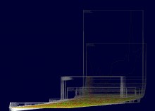
Complex or multi- or high-dimensional data is layered along a ‘visual z-axis’ that is far from being arbitrary. Hence the independence of scale.
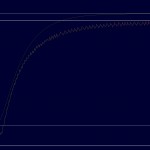
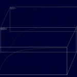
Here is a sequence of eleven slides that illustrate how any kind of data from any kind of application offers new insights via its vertical layers. Below is one sample showing CO2 emissions in 209 countries – once visualised by Excel and once with “3d metric” perspective by my generic prototype.
So what’s the advantage? What are the benefits?
1. additional visual effects through vertical layers for
- visual ranking, visual correlations and visual perspectives
2. extra metric information by quantifying
- sizes of layers, distances between layers and the slope of the “visual 3D axis”
- further quantifications through other parameters.
However, this extra information requires the tailoring to each specific application.
I also produced a few comparison of Excel graphs and 3d metric screenshots in my blog here and here.
Or only a few dimensions:
Next: Forecasting Time Series.


